
Text Is Where Upscalers Get Caught Lying
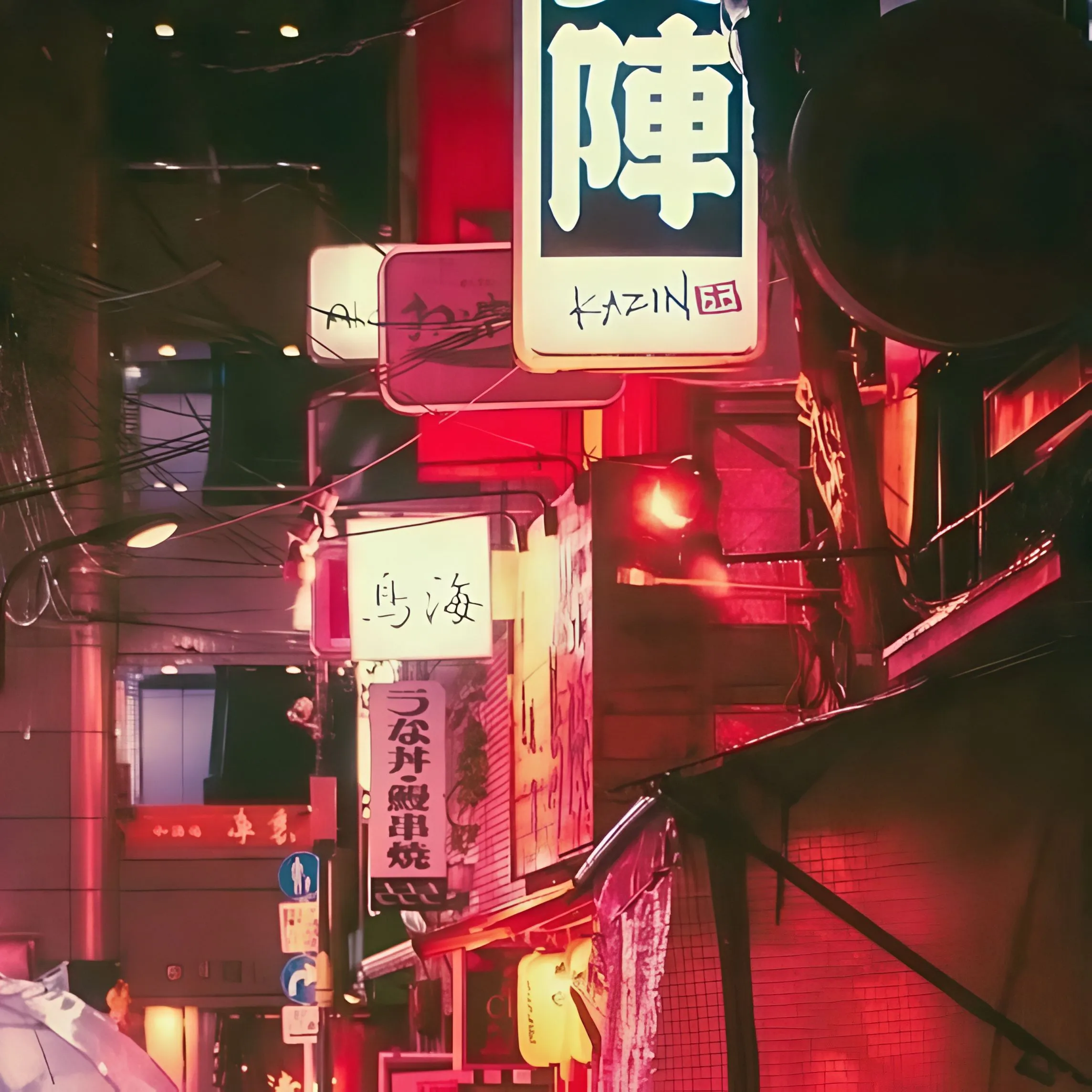
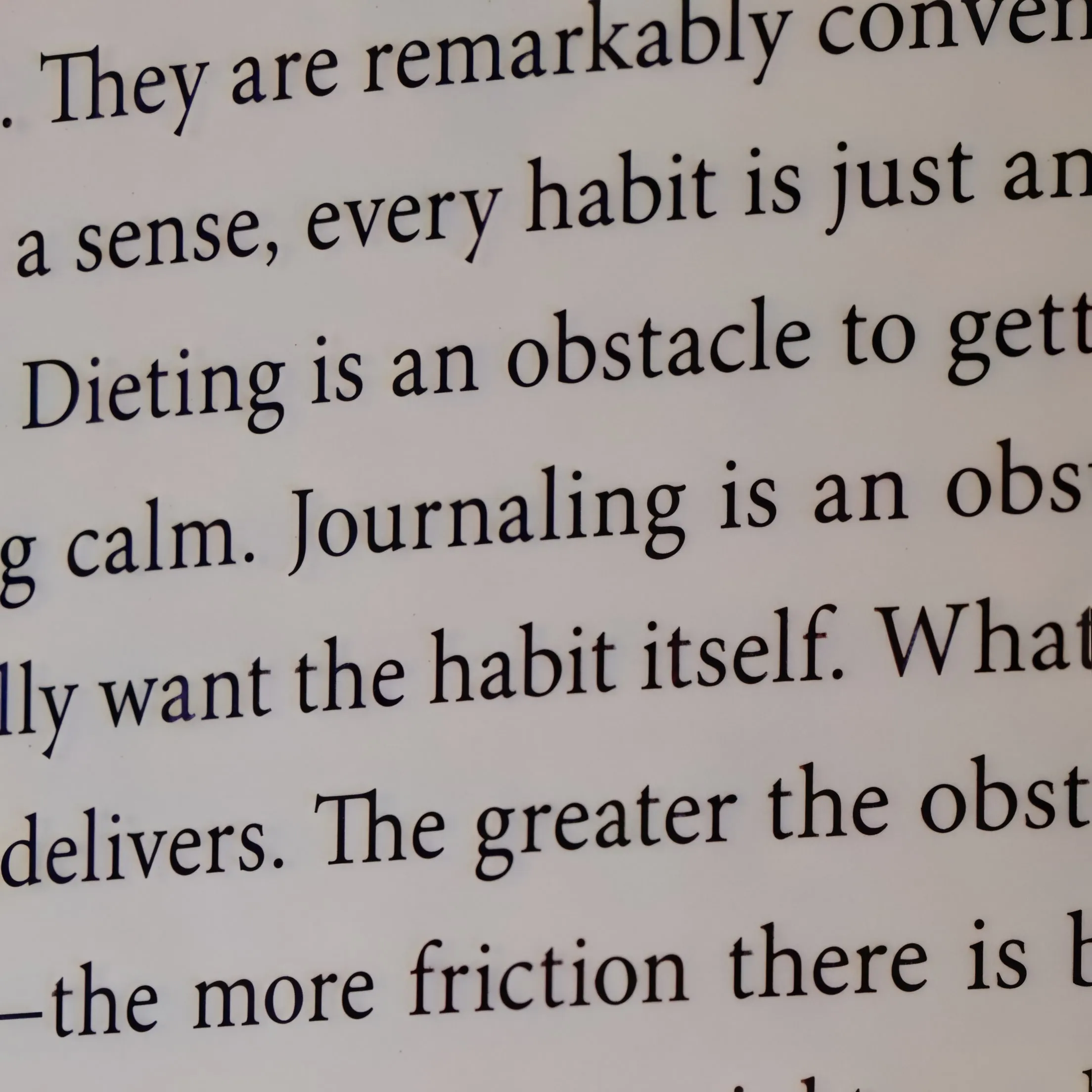
A slightly hallucinated tree branch is invisible. A slightly hallucinated letterform is gibberish. Text is the hardest content for AI enhancement because readers verify every stroke, which is why generic creative upscalers turn small print into convincing nonsense. The faithful model treats each letterform as structure to be sharpened, not repainted, and keeps font, stroke weight, and the contrast between text and background while multiplying resolution.
Where Legible Text Actually Matters
Scanned contracts and archival documents where every clause must stay verifiable, historical materials being digitized, screenshots in documentation and bug reports, whiteboard photos, old signage, and infographics that get reshared until compression destroys them. In each case the test is the same: can a reader zoom in and trust what they see? Upscaled output holds up to that test at print size and on high-DPI displays.
Settings That Work
- Model: any faithful model; P Image Upscale is the default in the upscale tool
- Scale: 2x for screens, 4x for reprints and OCR
- Enhance Faces: off
- Source: a PNG screenshot beats a re-saved JPEG, and a 300 DPI scan beats a phone photo
Before You Publish
Proofread any AI-touched text before it goes out. For documents headed to OCR, upscale first so the engine gets clean strokes to work with. Test a difficult scan on the free no-signup upscaler and zoom to 100% on the smallest line.